
I come from classical times where gentlemen’s mustaches were not just a hipster statement. I was born to a Parisian dynasty where my styles were a topic of conversation, and still are today. I fuse together classical and modern with thin horizontal lines even you know you cannot touch. Jealous? You should be. I am what you call an ageless font, that will never go out of style. Yes, there will be imitators, copies of me, but you will know when you actually see me…
I am Didot.
I was born in the 18th century (1784), when dark times were upon us and the French Revolution was on its way. “A watershed event in modern European history, the French Revolution began in 1789 and ended in the late 1790s with the ascent of Napoleon.” 1 The citizens of France had had enough with the monarchy and churches getting rich and enjoying an extravagant lifestyle, while the rest of France was in a financial crisis, suffering from droughts and starvation. When Enlightenment ideas entered people’s minds, they stormed to Bastille and Versailles to overthrow the monarchy and churches where the guillotine was working endlessly.1
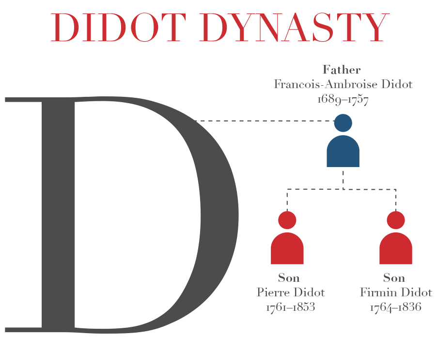
I was created by many hands of the Didot family. Francois-Ambroise Didot (1689–1757), the founder of a dynasty of printers and typographers in France, created a system to measure fonts with points, which became a standard unit to measure fonts to this day in Europe. He created the first neoclassical type in which my styles began to appear. 2 Following his father Francois-Ambroise, Firmin Didot created a more stylized font with sharp contrasts between thick and thin strokes, which soon characterized as modern or didone.“The typeface cut by the Didot family in France was even more abstract and severe than those of Baskerville, with slablike, unbracketed serifs and a stark contrast from thick to thin” 3
My sharp contrast between thick and thin became extremely popular during the French Revolution. I represented a new era of industrial and social progress. I replaced the typeface Geraldes, which represented Ancien Régime. Many other typefaces also suffered during the French Revolution, as they were melted down for wartime and printers had to purchased me, Didot. My styles made the Didot family a household name. I was used exclusively in Imprimerie Nationale, which included the constitution for France.2 National Exposition deemed me to be "the most perfect typographic creation of any country and in any age." They made models of me for every printer, both in France and throughout Europe."2 Firmin Didot was later known as one of the greatest European romantic designers of type. 4
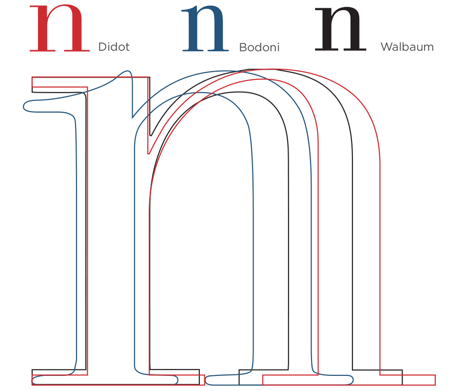
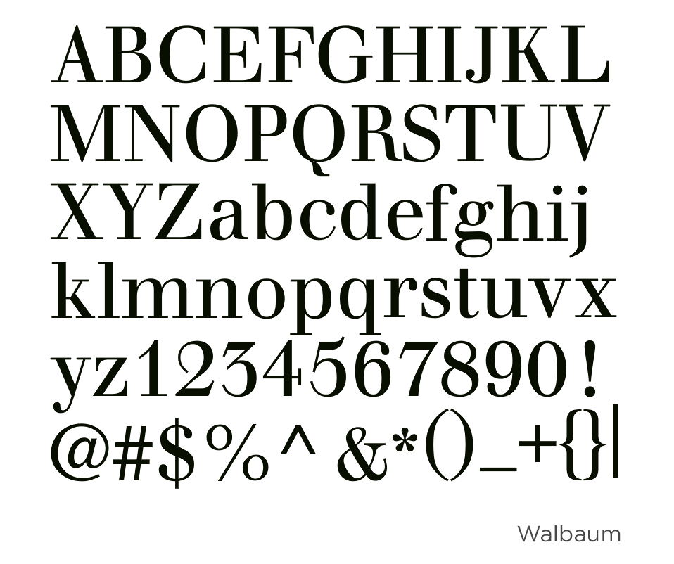
I started a new era of “modern” typeface, along with Ga. Bodoni in Italy who created Bodoni and Justus Erich Walbaum in Germany who created Walbaum. We were classified as Romantic letters. Some may say that Romantic letters like me can be beautiful, but lack some of the elements of Renaissance forms, such as flowing and steady rhythms. Some even go as far to say that Romantic letters force the reader to stand outside the text, peering in at the letters, while the rhythm of the Renaissance type invites the reader to enter and read. 4 I accept these criticisms, yet continue to be relied upon as a clean, classic font even today.
Since the French Revolution, I have been redrawn a few times by Hoefler and Frere Jones (now Hoefler and Co.) and Adrian Frutiger.
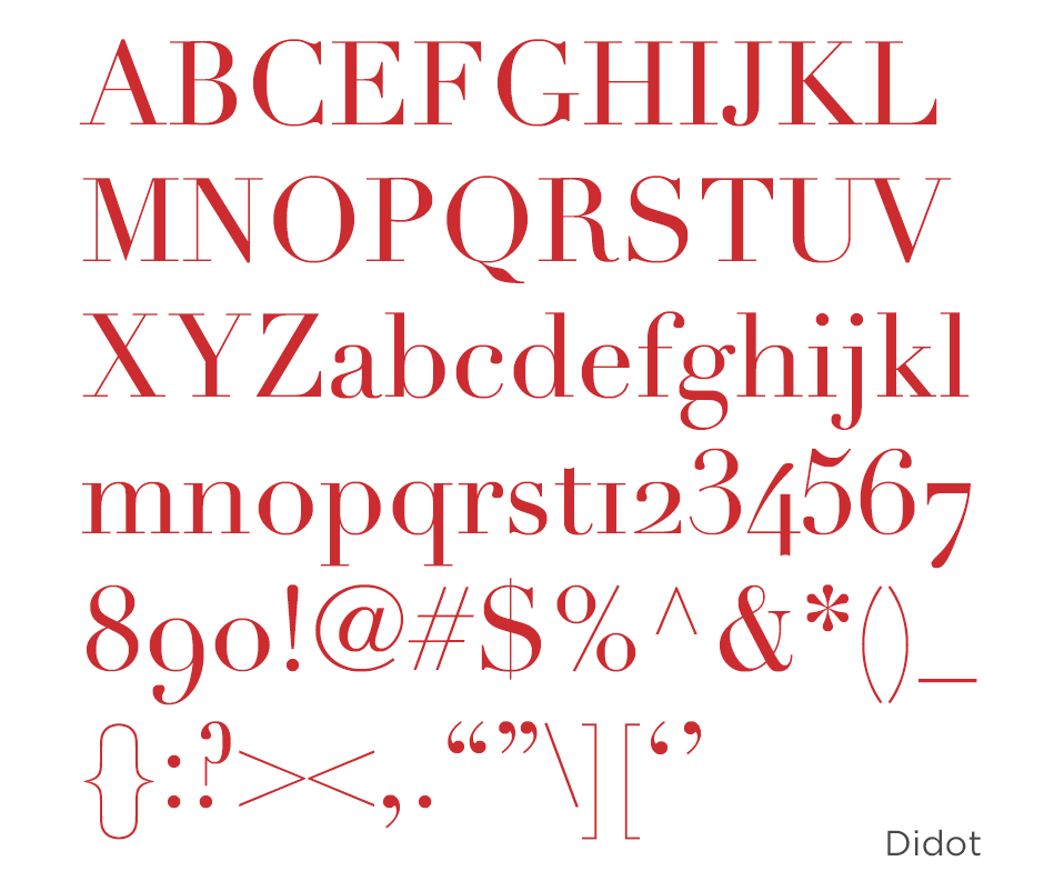
I am a classical typeface. Time may pass in the universe, but I continue to be ageless. My sharp contrast gives my form a certain unsurpassed elegance. It demonstrates that I have power and in control. Even you can look, but cannot touch my sexy lines. In these so-called modern days, you will see my type reign on the covers of magazines and in television show titles alike.
I am Didot;
I am here to stay.